
I’m a tad behind my own schedule. It’s been a busy week. But I want to record my impressions from the Liz Haywood-Sullivan Workshop hosted by the Mid-Atlantic Pastel Society last weekend.
Because it was a three-day workshop (Saturday, Sunday and Monday) we were fortunate enough to keep to the original dates falling on President’s Weekend, so we had a holiday to work through. This was a real boon for the gainfully employed and it tells me a lot about Liz’s dedication to promoting pastel work by being willing to give up her own holiday weekend to spend it with us.
I actually took a lot of pictures, but the lighting in the room went far into yellow and it really threw off how my photos came out. But I will share a few below.
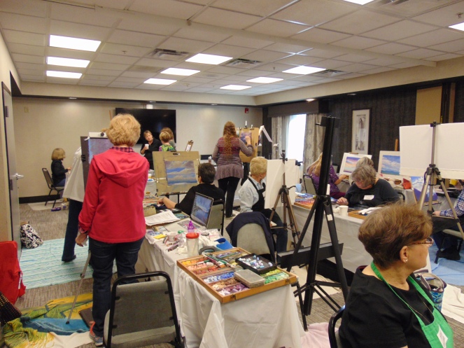
We all arrived by 9 and got to work at 9:30 a.m. Each morning Liz gave a demonstration of technique and subject as it related to the technique and then turned us loose after lunch to work on our own paintings. We each arrived with our own easel and our own pastel collections and paper. I have a fairly good collection of Terry Ludwigs and supplemented with Liz’s recommendations for Giraults (the greys).
My one disappointment was the pre-mounted UArt. Unlike previous UArt paper I’ve purchased, this batch produced a weird “warple” (my own made up word to reflect the warp and bubble effect I was experiencing). I’m hoping the problem is limited to just one envelop and not both, but time and attempt to use it will tell. It did fine with the underpainting, but trying to bring up the next several layers using the side of the pastel, just did not work for me.
I learned a lot and I highly recommend that if you want to learn about your pastels and how to paint landscapes with them, take one of Liz’s classes. She covered many things but I think the most valuable for me was the one area I struggled with the most: finding the right value in the landscape. Did I figure it out why there? Nope. But I’m a lot closer and understand much more about how to start dark and build up and out from there using same and close values over the underpainting and then building up to the lightests lights.
I re-learned how to size up from an existing reference photo to the correct paper size and visa-versa, how to size down for thumbnails. I really came to appreciate the exercise of doing several thumbnails. The first ones to get the composition and then the next several to get the value study down. Making little color marks on a scrap paper or in the margin of the painting really helped me identify better which pastels I wanted. A lot of times what the stick looks like is very different from what it looks like on the paper in relation to the other marks around or under it. I also learned that value, as opposed to hue, is the real secret to landscape painting. In one of the photos below, the reference photo Liz used is very blue, but her painting is very warm and yellow and yet, it’s right.
I am envious of Liz’s ability to paint subtlety. Perhaps with a few more year’s work, I’ll get close. But to have the opportunity of watching a real master work and sort get an inkling of how she gets what she gets… well, I would have been happy to just watch her demo all day. It was helpful to have her come around and answer questions and help figure out how to overcome various difficulties we caused for ourselves and she was always kind, which I greatly appreciated.
So, my bottom line take away is that I need (really need) to set up a good (and subtle) pastel plein air kit. I learned I have a lot of practice to do to see better. My values tend to be too dark to start. She walked us out side over and over again to just look at the sky and really LOOK at it with all it’s quiet gradations. It’s the stuff that photographs just can’t capture. And I need to get back to my easel(s) both inside and out and paint more. I was afraid I would feel pushed to paint bigger, but I don’t. However, the impact of a larger piece cannot be under estimated.
I’m surrounded by water where I live and I feel very challenged by it and I’m even more enthused about this year’s plein air season coming up. I know that the more I paint and work with pastels, the better I will get and the easier it will be for me to interpret the landscape.
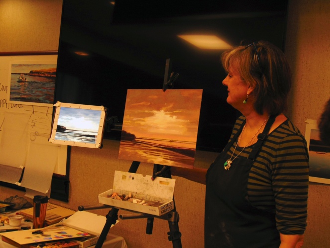


Day Two Demonstration. I felt very vindicated that my block ins are equally as scant, but I must admit her thumbnails are a lot more useful than mine.
The workshop was worth every penny and my work will be the better for it.

Very nice write up, looked like fun!
LikeLike
It really was a lot of fun…but really challenging…
LikeLike